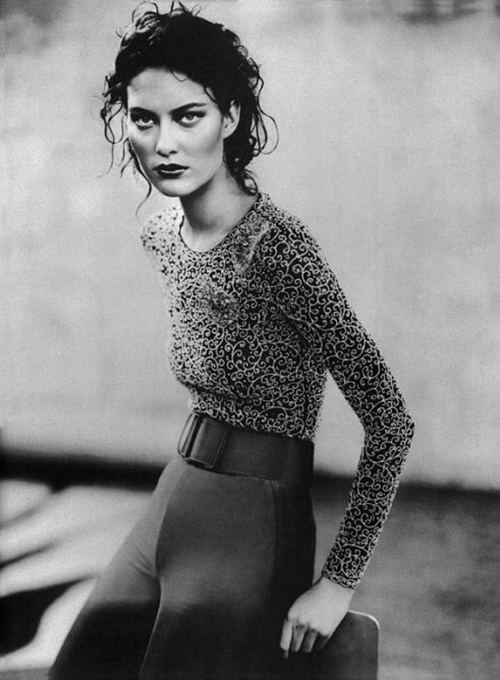
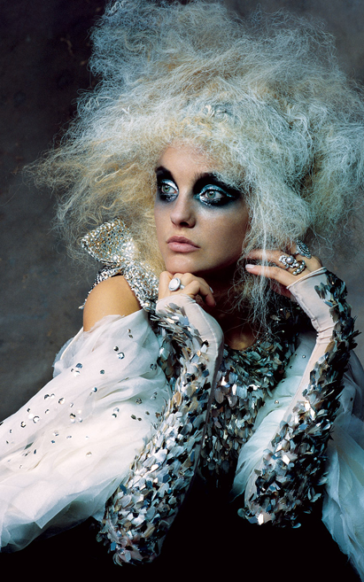
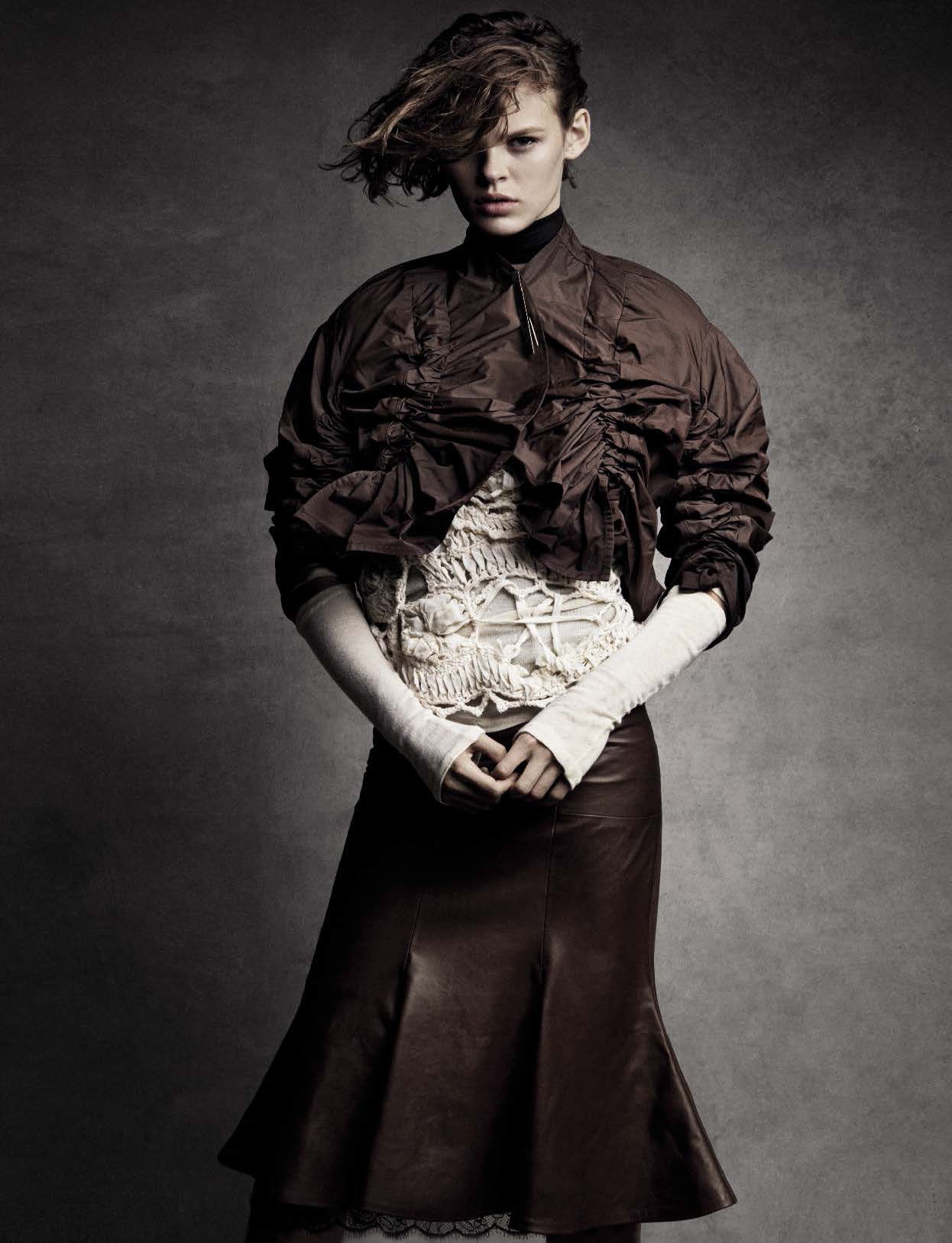
Italy changed what I paid attention to.
Working for Vogue Italia and agencies across Milan and Rome, I developed a series of typefaces that grew out of that context—out of fashion, out of the particular elegance and restlessness of that world.
Like the photography of Paolo Roversi,
they’re not about statement. They’re about atmosphere.
The line of a Letter—like the line of a dress—says what words can’t quite reach.